Optimizing Your Screen for Text-Heavy Tasks: A Guide to Comfortable and Efficient Reading
- 76

In an era where digital landscapes dominate our workspaces, the shimmering glow of a monitor is a constant companion. Whether it's drafting a report, coding a new piece of software, or simply responding to an endless barrage of emails, the majority of us find ourselves locked in a visual tango with text on screens for the better part of our days. But have you ever stopped to consider how your screen settings might be affecting your ability to work with text? It turns out that a few smart adjustments to your screen can make a world of difference to your comfort, focus, and productivity.
Introduction to Screen Ergonomics for Text Work
Before diving into the nitty-gritty of screen settings, it's crucial to understand the concept of screen ergonomics. This is the study of how your physical setup—including your screen—can be optimized to reduce discomfort and prevent the strain that comes from prolonged periods of use. When working with text, it's particularly important to ensure that the settings on your screen align with ergonomic principles to minimize eye strain and maximize reading clarity.
Achieving the Right Brightness and Contrast
The first step in optimizing your screen for text work is adjusting the brightness and contrast. Ideally, your screen's brightness should be in harmony with your surrounding environment. A screen that's too bright in a dimly lit room can be as glaring as a lighthouse at midnight, leading to eye fatigue. Conversely, a display that's too dim can cause you to squint and strain your eyes to decipher the text. Finding that sweet spot where your screen is neither too bright nor too dark is essential.
When it comes to contrast, high contrast is your friend for text-heavy tasks. This typically means dark text on a light background. This high contrast ratio helps make text stand out and can significantly reduce the effort required to read for extended periods.
Navigating Color Temperature and Blue Light
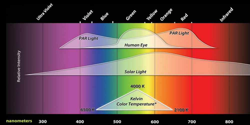
Color temperature plays a subtle but crucial role in how we perceive text on screen. Cooler color temperatures with more blue light are energizing and can help keep you alert, but they're also notorious for interfering with sleep patterns if you're exposed to them in the evening. To counteract this, consider using software solutions that adjust the color temperature of your display based on the time of day, reducing blue light as bedtime approaches.
During working hours, however, ensuring that your screen doesn't lean too far towards warm or cool can help maintain focus without unnecessary eye strain. A balanced, neutral white is often best for reading text, as it provides clarity without skewing towards the harshness of blue light or the drowsiness that can come with overly warm tones.
Font Size and Spacing: The Devil's in the Details
It's not just the screen's light and color settings that matter; the way text is presented plays a significant role as well. While you may not have control over how every piece of text is displayed, you can often customize the font size and spacing in your text editors, web browsers, and other applications. Opting for a font size that's comfortable to read without squinting or leaning in can prevent eye strain. Additionally, adequate spacing between lines of text (leading) and between characters (kerning) can make a substantial difference in readability.
Positioning Your Screen for Optimal Reading
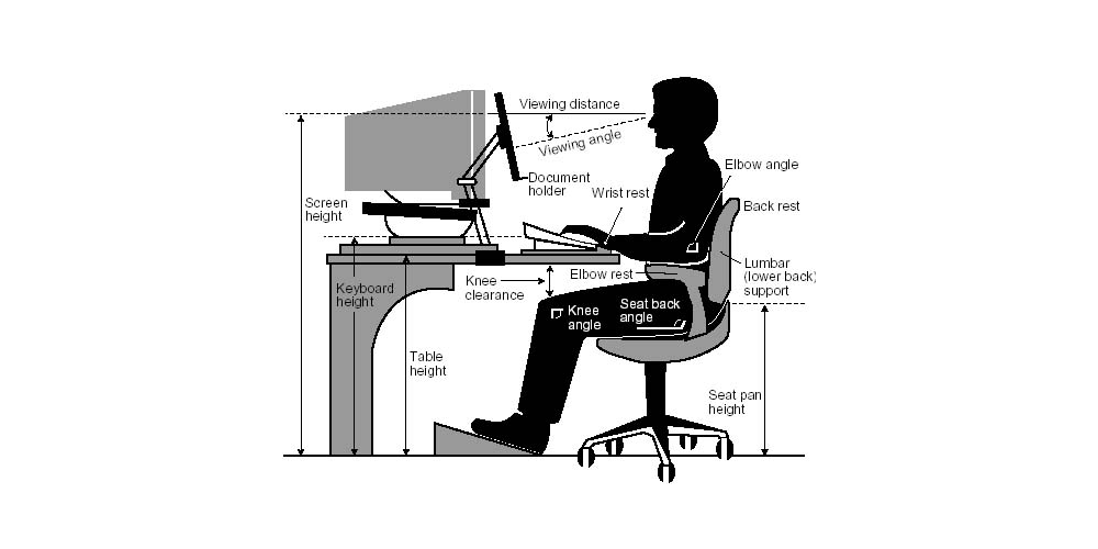
Where your screen sits in relation to your eyes can influence how easily you can read text. The optimal position for your monitor is at arm's length, with the top of the screen at or slightly below eye level. This encourages a natural downward gaze, reducing the risk of neck strain and keeping the amount of exposed eyeball surface to a minimum, which can help in reducing eye dryness.
Remember to Take Breaks
Even with the perfect screen setup, taking regular breaks is important to give your eyes a chance to rest. The 20-20-20 rule is a helpful guideline: every 20 minutes, take a 20-second break to look at something 20 feet away. This helps reset your focus and provides a much-needed pause from the intensity of screen-based reading.
Conclusion: A Tailored Approach to Screen Settings
As we navigate through the digital text that fills our workdays, taking the time to tailor our screen settings can lead to a markedly improved experience. By adjusting brightness and contrast, being mindful of color temperature, choosing appropriate font sizes, positioning our screens effectively, and remembering to take breaks, we can create an environment that supports both productivity and eye health. Remember, these suggestions are a starting point; the best settings are the ones that feel right for your eyes and enhance your comfort during those hours of screen engagement. So go ahead, tweak those settings, and turn your text-based tasks into a more pleasant journey through the digital word forest.